The website as a book
Roughly one month ago I pushed a re-design of this website. Perhaps since it coincided with the IndieWeb Carnival I was hosting, I received a lot more feedback than I normally do, which was helpful in pointing out to where I could further refine my design. I decided instead to give it another go from scratch.
Everything in my last essay outlining my approach remains valid. Reducing CSS variables, refined spacing, heading consistency, progressive enhancement, avoiding multi-level dropdown menus all continue to be observed. A key change is in the typography: there are three typefaces now instead of one, but they do not come at the cost of increased bandwidth. This website also remains environment friendly same as before. The new index too exists and is even better now.
So what did change? I did the same things as before but differently. And, I would like to think, better.
I view my website as an extension of a book. That was the spirit I attempted to capture in my last redesign but perhaps went too far with it. This time I was more attentive about reminding myself that I am still designing a website, not a book. The other realisation—perhaps a really elementary one—led to me discarding the basic page structure I was using earlier. The last design saw a vertical split of every webpage into two (like a book) but I no longer use that approach. My realisation was simply that when we read a book, we do not read a spread, rather just one-half of it. And that half alone corresponds to a page on this website—such as this one—and not the entire spread.
The other big influence was navigation. Websites have navigation menus in some form, and this one is no different. But in a book once we read a chapter we move on to the next or, if chapter ordering does not matter, we return to the contents page and plan our next read. By contrast websites retain an old SEO-driven philosophy of ‘retention’ i.e. the idea that websites must try to retain users. Perhaps this makes sense for Amazon (although I would venture to question that too) but for my website, I prize an unparalleled reading experience above user retention; indeed I am explicitly against methods that try to steer user behaviour through ‘retention’ at least on personal websites. So once someone reads an essay it was important for me not to link them to another without their intention. So I offer various CTAs (donation, newsletter subscription, webmention etc.) along with a simple ‘more’ link or ‘shuffle’ for anyone who does in fact want to read something and is open to anything I might have to offer.
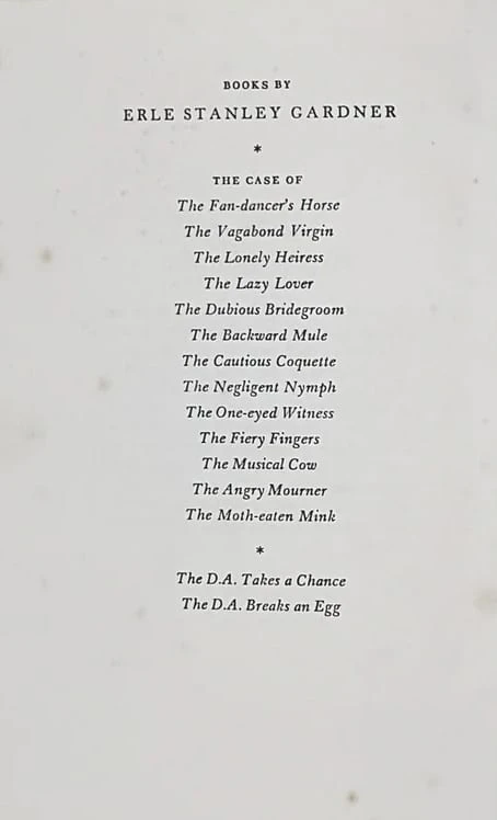
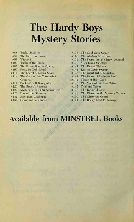
This ensures whoever wants to read more is choosing to read more. This has a parallel in books too and one I have noticed ever since I read my first-ever novel (The Hardy Boys #38, The Mystery at Devil’s Paw). At either the end or start of a novel the reader is suggested more books from the publisher or, more often, from the same author.


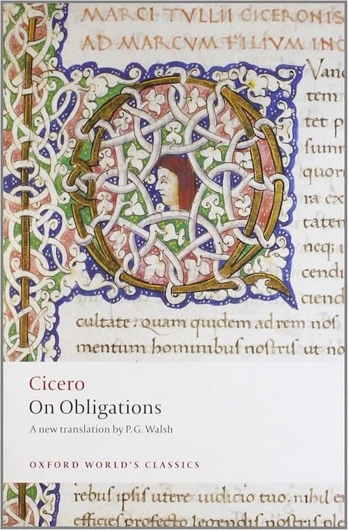
There were other books too whose influences pervade this website. For example the new primary typeface, Equity, is a digital rendition of Ehrhardt with plenty of improvements, building on its “narrow darkness and passive style that suits reading” as the typographer Jean François Porchez once described it. I first stumbled upon Ehrhardt when reading the Oxford World’s Classics version of Cicero’s On obligations (pictured above) and immediately found myself adoring the typeface.
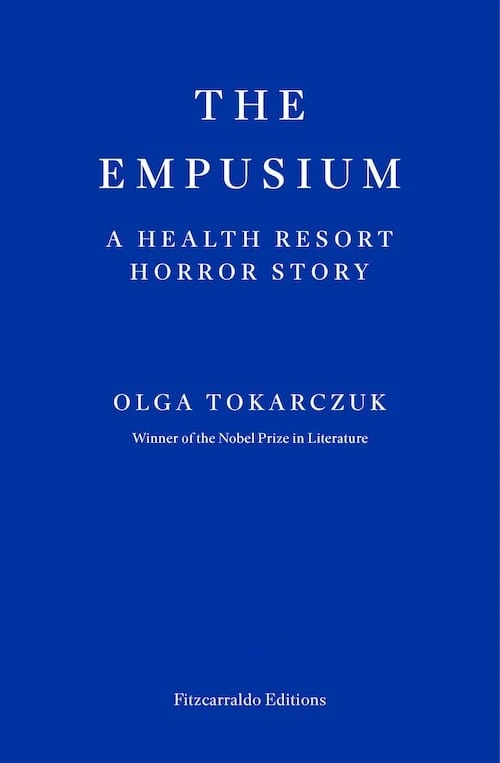
A second, more recent book that influences this website in some capacity is the Fitzcarraldo Edition (a British independent publisher) of Olga Tokarczuk’s The Empusium, which I am currently reading. There is an elegant simplicity in the book, designed by Ray O’Meara, which uses Yves Kline’s blue and a custom typeface and little else but the author’s words. This pushed me to strip all other aspects of design—including lines, extraneous figures, excessive use of colours and shades etc. while not making the mistake, once again, of taking things too far.
I also looked to the likes of Gallimard to understand what it was about the elegance of books that, first, appeals to me, and second, makes me want to expand to my website. I was reminded of Kris Sowersby’s words in designing his typeface ‘Pitch’ wherein he says, “Pitch has a very specific feel, a synthesis of digital and analogue that evokes—not emulates—typewritten text.”
I realised that my previous design had emulated books and, as a website, was not the best I could do. With this reiteration, which I internally codenamed Gonville, I feel like I have done a better job of ensuring this website evokes, not emulates, the feeling of a book.
This is a note: a brief thought (well maybe this one was not so brief) or notable piece of information from my commonplace book. For longer writings, please see ‘Essays’.